Cart icon 설치하기
assets 폴더에 아이콘 svg를 입력한다.
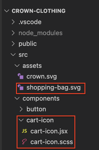
components에 cart-icon 폴더, 파일 만들기
cart-icon 내용을 채워준다.
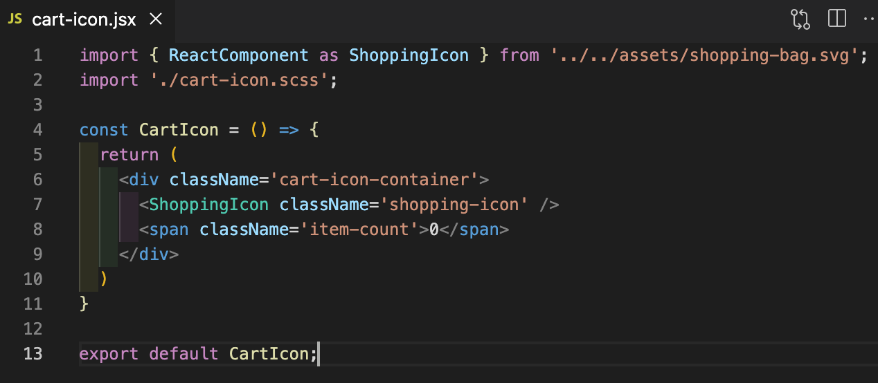
import { ReactComponent as ShoppingIcon } from '../../assets/shopping-bag.svg';
import './cart-icon.scss';
const CartIcon = () => {
return (
<div className='cart-icon-container'>
<ShoppingIcon className='shopping-icon' />
<span className='item-count'>0</span>
</div>
)
}
export default CartIcon;
cart-icon.scss

.cart-icon-container {
width: 45px;
height: 45px;
position: relative;
display: flex;
align-items: center;
justify-content: center;
cursor: pointer;
.shopping-icon {
width: 24px;
height: 24px;
}
.item-count {
position: absolute;
font-size: 10px;
font-weight: bold;
bottom: 12px;
}
}
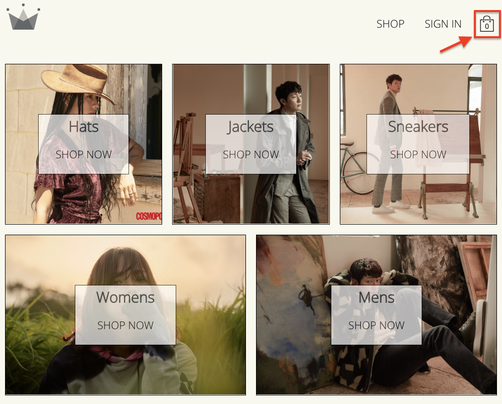
이제 navigation bar에 cart-icon을 넣어준다.

아이콘이 생긴 것을 볼 수 있다.
Dropdown
components에 cart-dropdown 파일을 만든다.

cart.dropdown.jsx 기본 내용을 채운 후
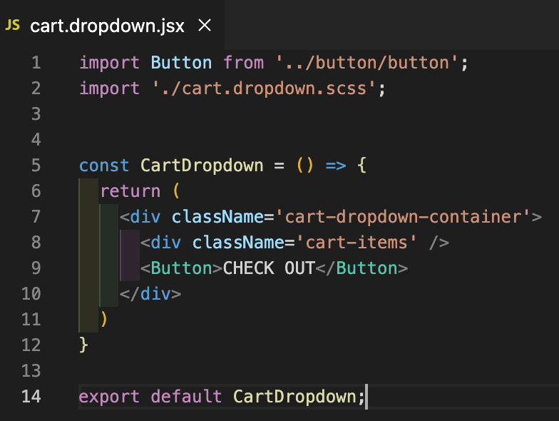
cart.dropdown.scss 내용을 채워준다.

.cart-dropdown-container {
position: absolute;
width: 240px;
height: 340px;
display: flex;
flex-direction: column;
padding: 20px;
border: 1px solid black;
background-color: white;
top: 90px;
right: 40px;
z-index: 5;
.empty-message {
font-size: 18px;
margin: 50px auto;
}
.cart-items {
height: 240px;
display: flex;
flex-direction: column;
overflow: scroll;
}
button {
margin-top: auto;
}
}
naviagation으로 가서 CartDropDown 을 import 한다.

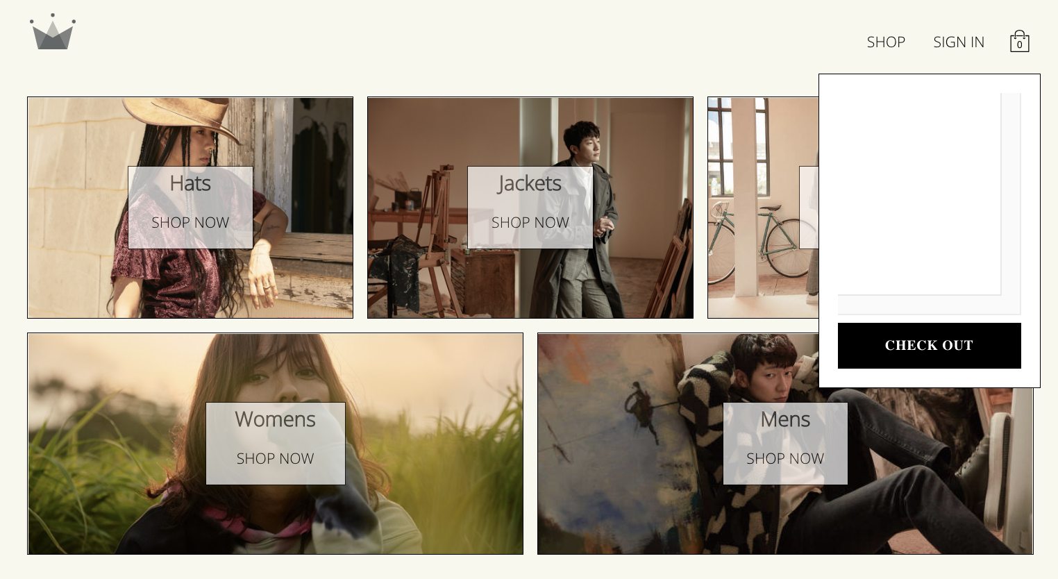
화면에 나오는 것을 볼 수 있다.
다음 포스트에서 토글 시키는 법을 알아보자.
'React > E-commers App' 카테고리의 다른 글
| 의류 쇼핑몰 32 | product-card 만들기 (0) | 2022.07.01 |
|---|---|
| 의류 쇼핑몰 31 | products.context.jsx 만들기 (0) | 2022.07.01 |
| 의류 쇼핑몰 30 | shop-data.json (0) | 2022.06.30 |
| 의류 쇼핑몰 28 | Auth Listener (0) | 2022.06.29 |
| 의류 쇼핑몰 25 | Context 2 | context에 데이터 입력과 출력 (0) | 2022.06.18 |


댓글